Deco payments User app
Team: B2C Product manager, PD, PMM,
My role: Lead designer, full product ownership
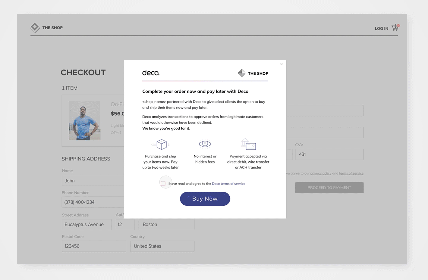
Deco is a B2C payment solution, that provides legitimate customers a way to pay for their purchase on spot, in case that their card was denied by the bank. After the order is submitted, the users has 2 weeks to login to the user-app, apply a payment method, and pay for their orders.
Deco offers two possible payment flows: “Schedule payment” and “Installments”. This app is a mini-app, due to the fact that in most cases there the user visit it only once, when they sumbit the payment.
a. User journy
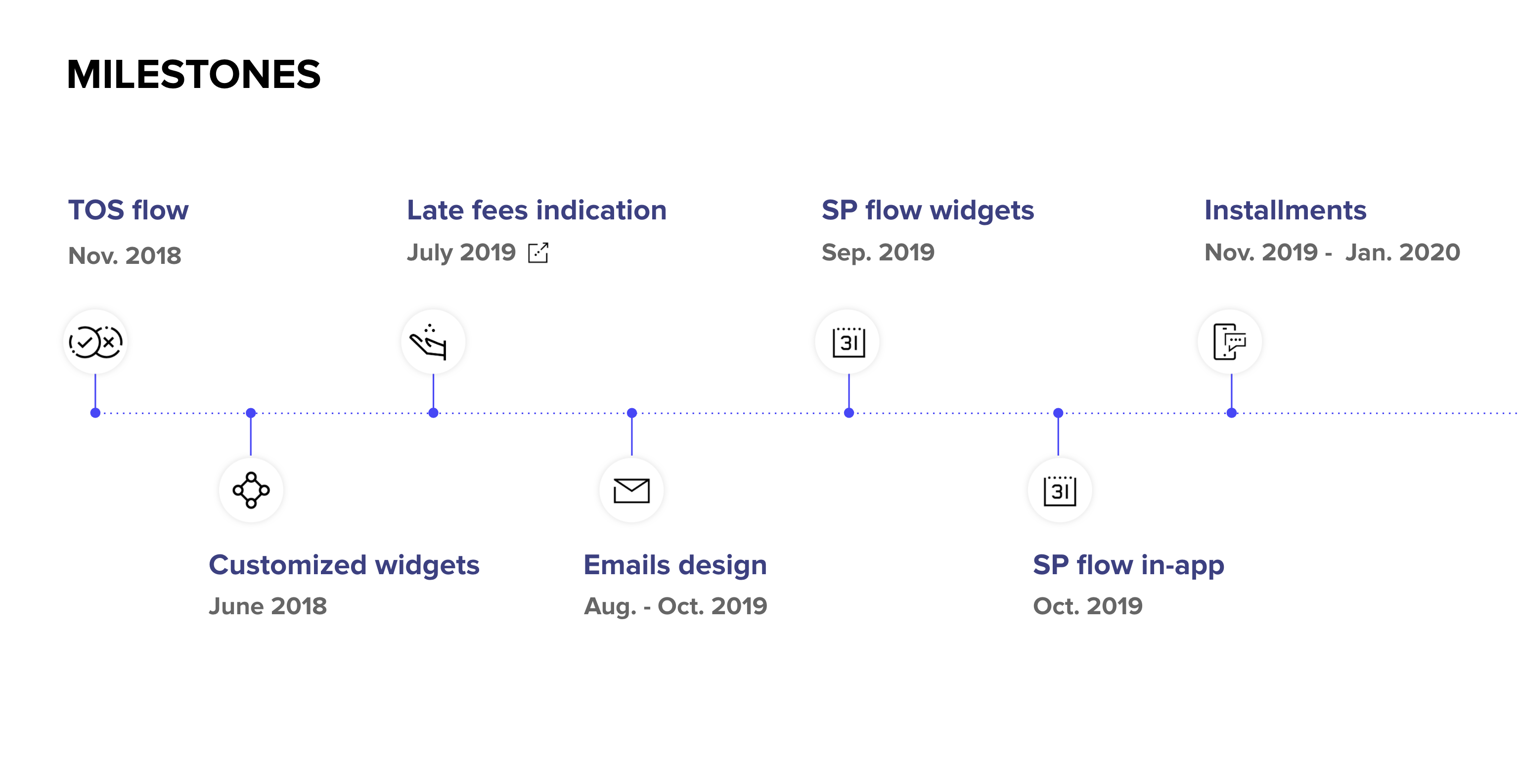
b. Product evolution
![]()
CASE STUDY
Establishing Deco “One pager” app
Business challenge
As Deco’s product evolved and new solutions were launched, we needed to rethink the user app to better serve customers completing different flows (e.g., Schedule Payment, Installments). Additionally, there was an inefficient in-app payment process that required simplification and improvement.
1. User survey
We partnered with a big fashion retailer and conducted an online survey targeting users who went through Deco’s flow during their purchase. We also included default users (those who did not return payment) and successful users who paid back.
The survey aimed to:
- Characterize users as either opportunistic (single-time users) or potential return users.
- Understand user perceptions and experiences.
Survey takeaways
- Lack of familiarity with our brand raised trust concerns.
- Users were overwhelmed with accounts and hesitant to use another service.
- Urgency played a significant role in user decisions.
- Some users did not understand the product flow.
- Users were overwhelmed with accounts and hesitant to use another service.
C. User Survey- quotes
![]()

2. Mapping App Architecture
I mapped all possible flows and entry points, including emails, to identify key user actions upon entering the app.
D. User lifecycle
![]()

Final takeaways
- Deco’s user portal is unique: users don’t need to access it if everything goes well (“Happy Flow”).
- The urgency to access the app arises only when an order process fails.
Conclusion
We concluded that the app's main view should focus on a single order view, showcasing the current user order being processed.
This streamlined approach ensures the app addresses user needs effectively while improving the overall experience.
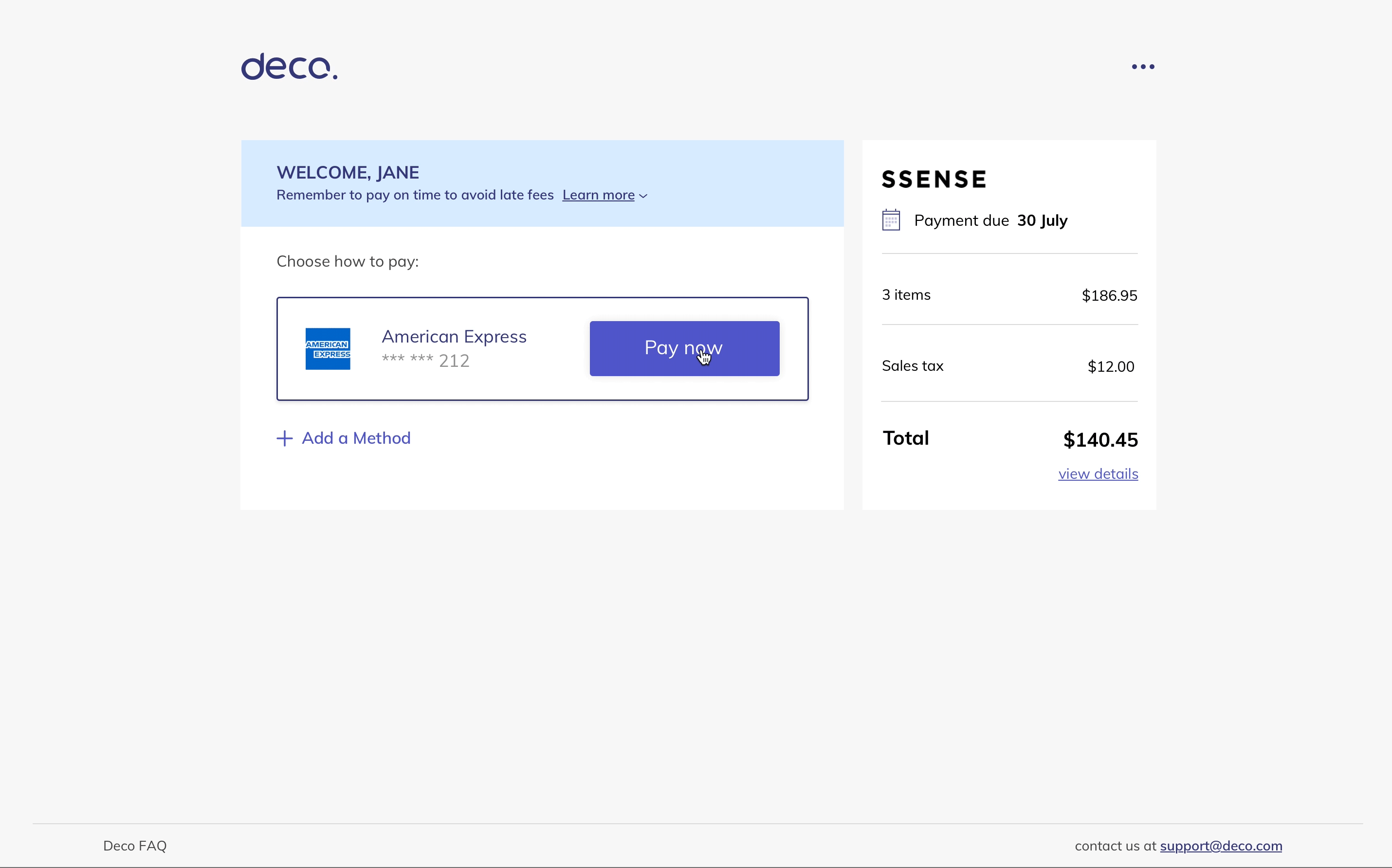
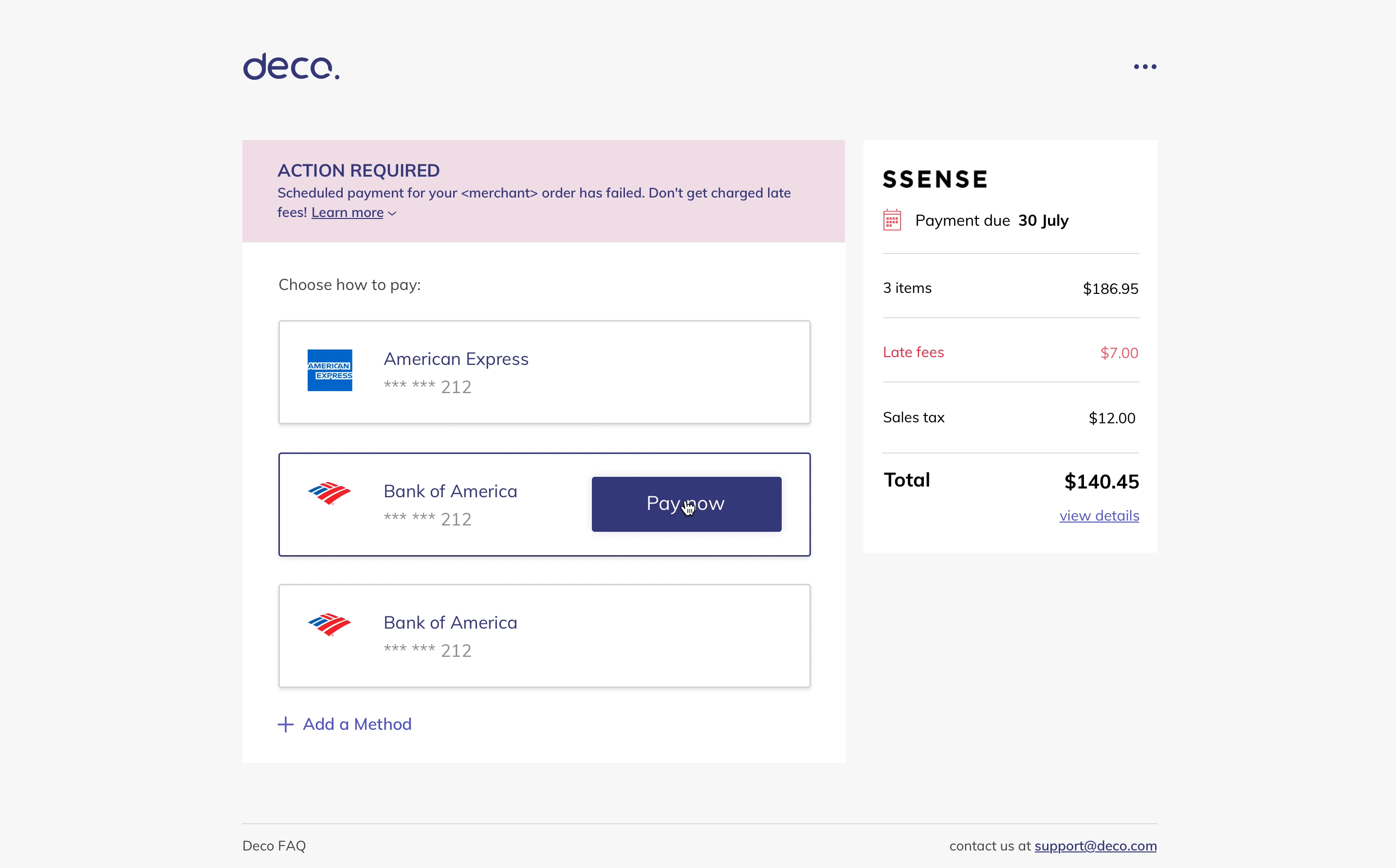
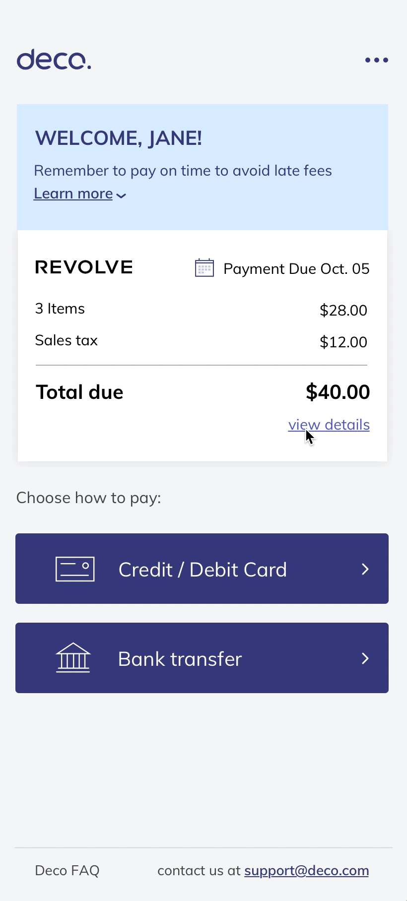
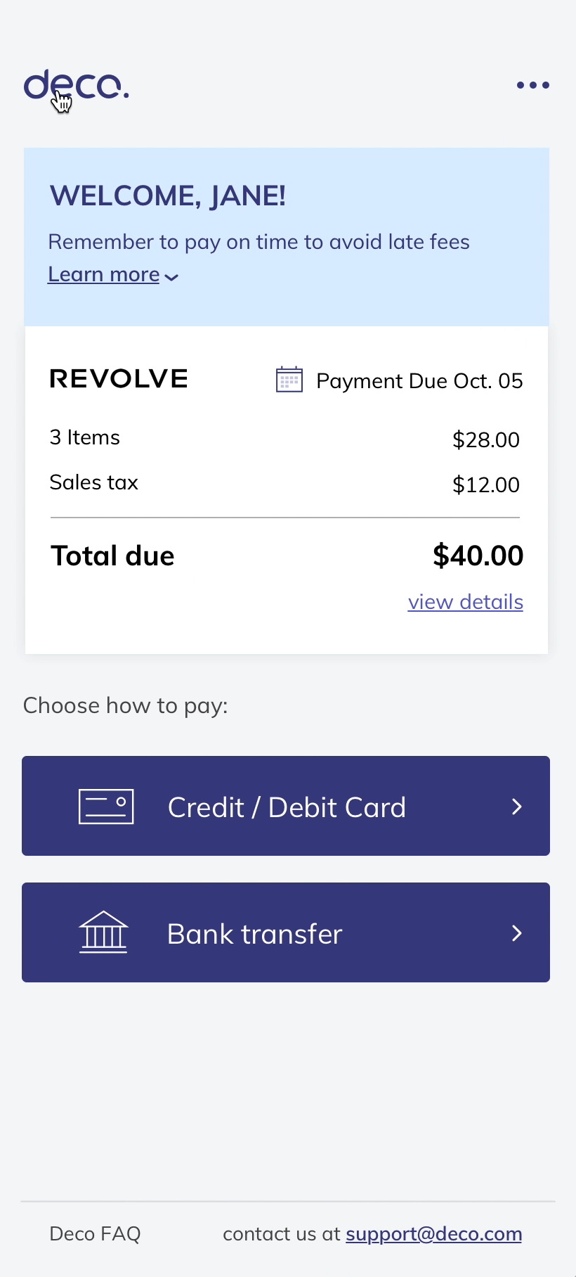
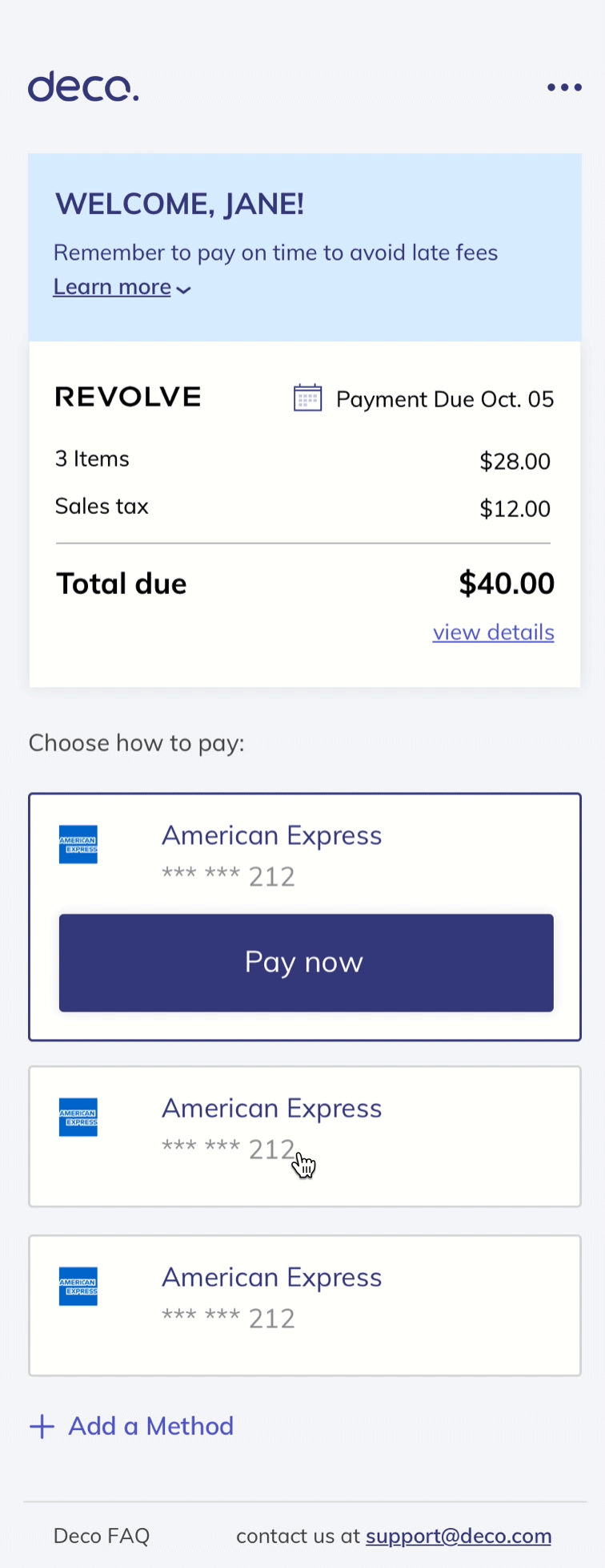
Schedule payment flow
![]()
![]()
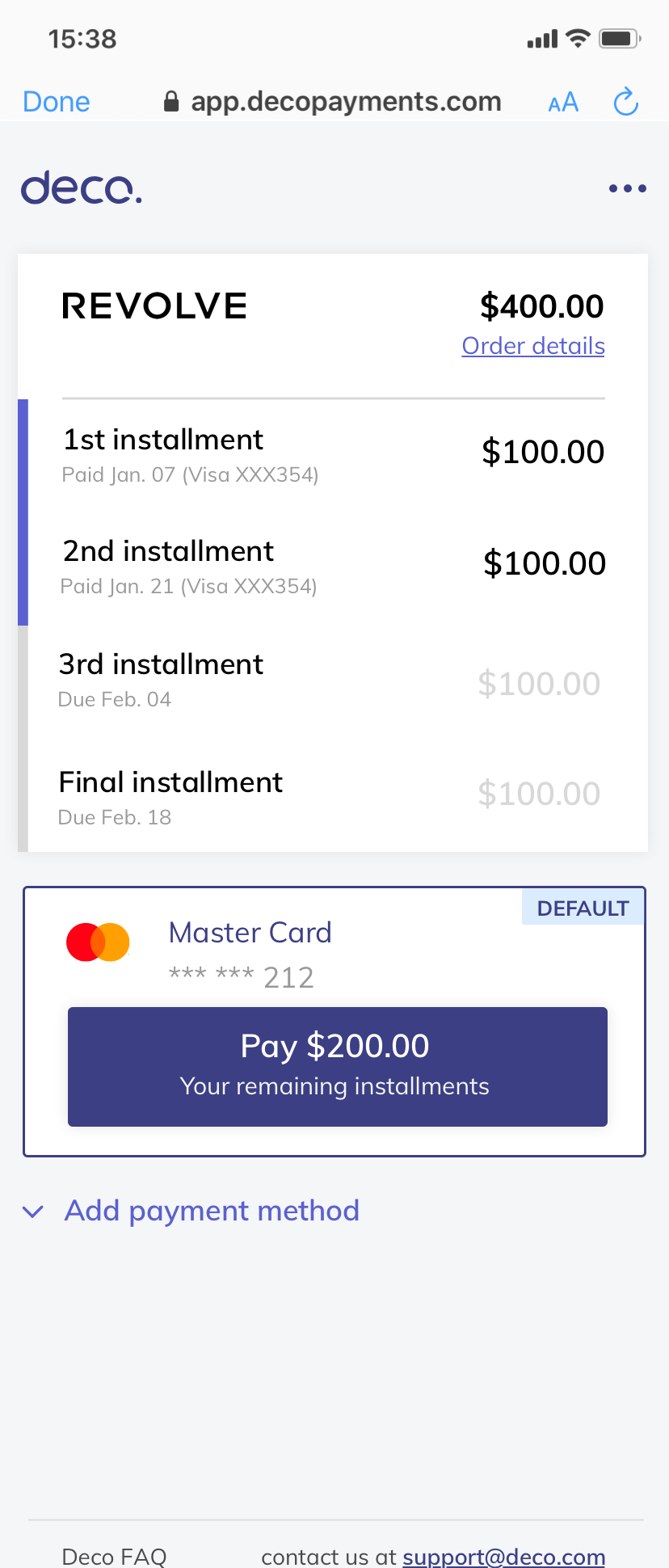
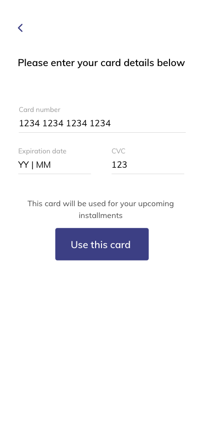
Installments flow


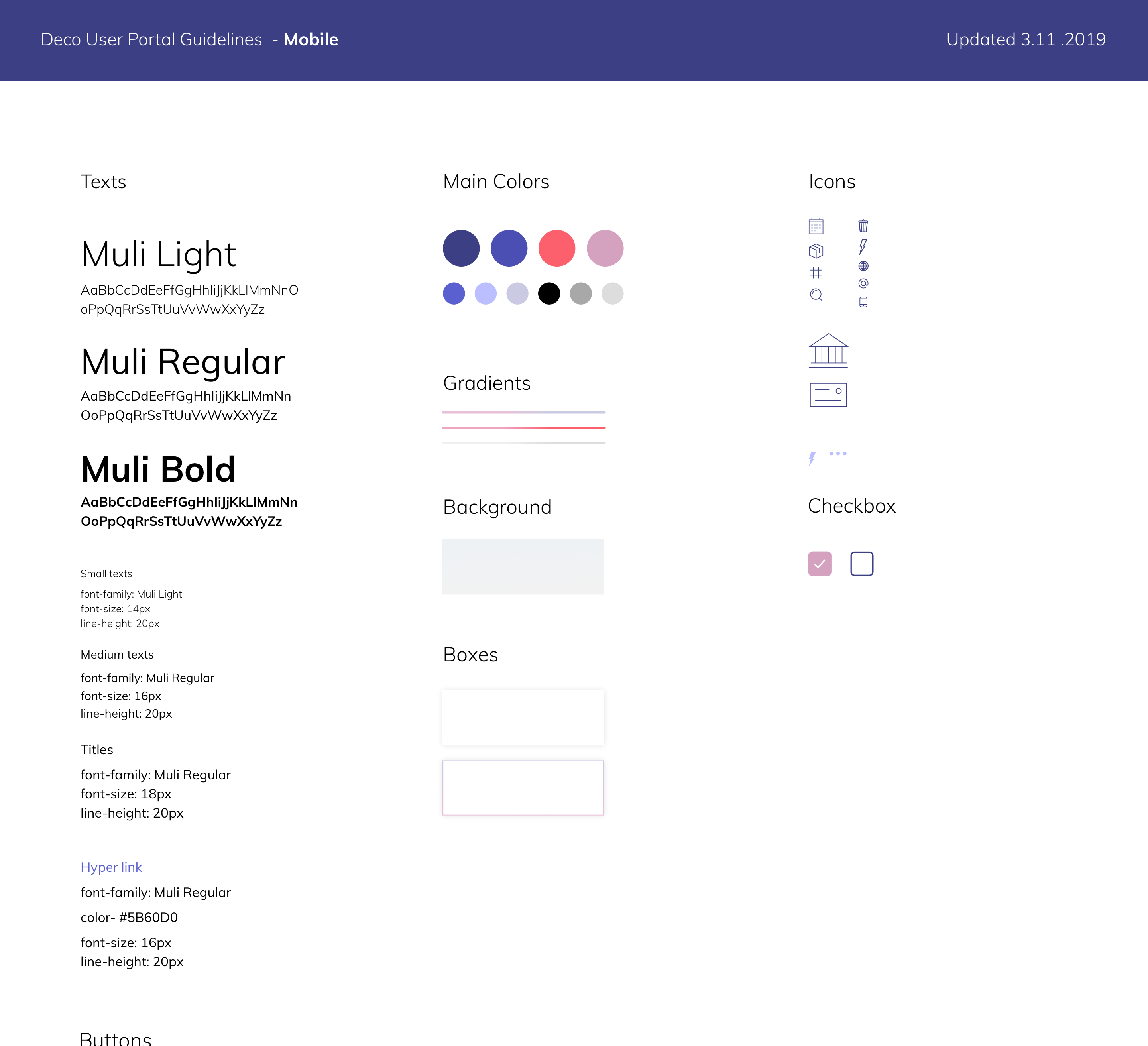
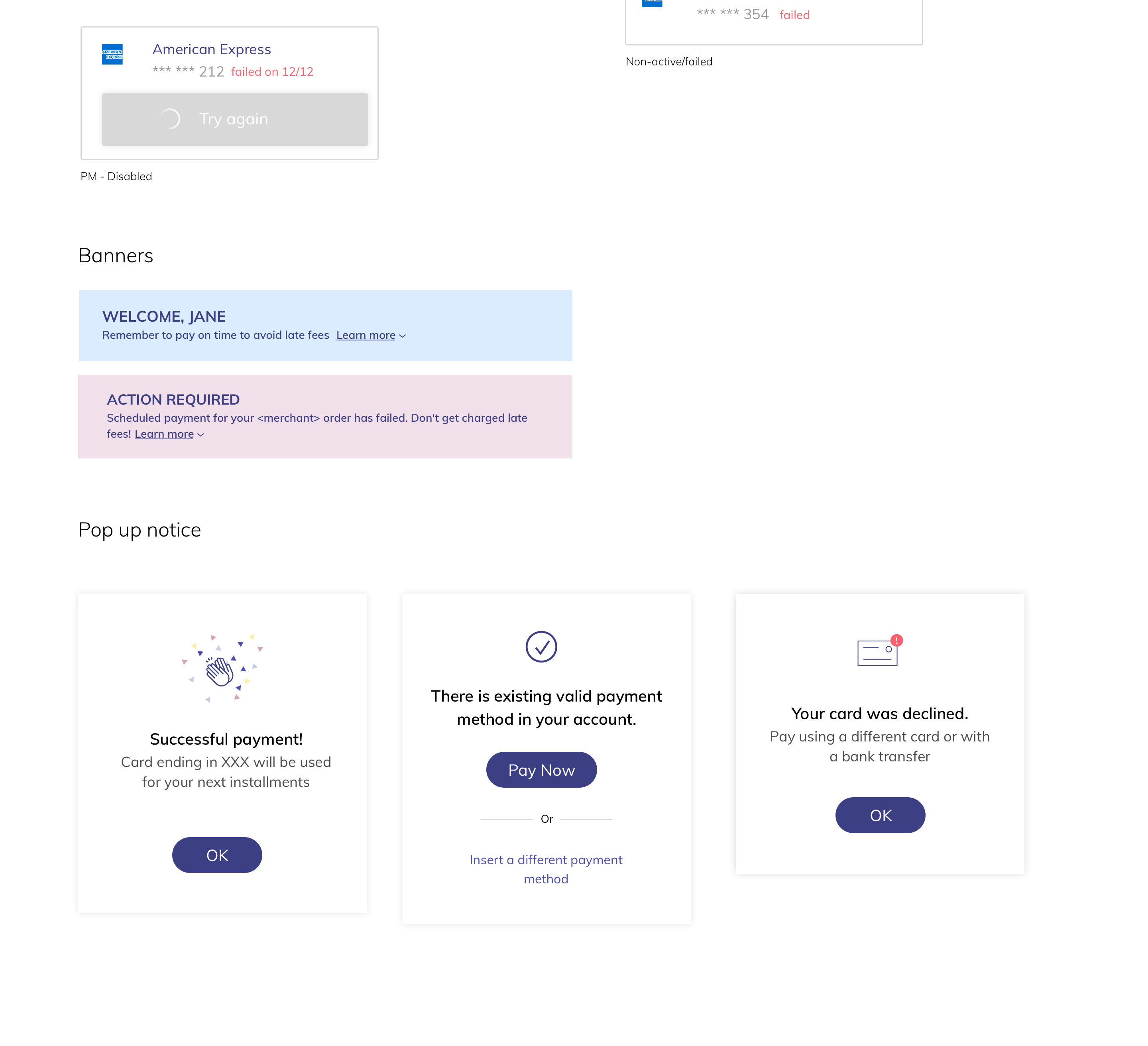
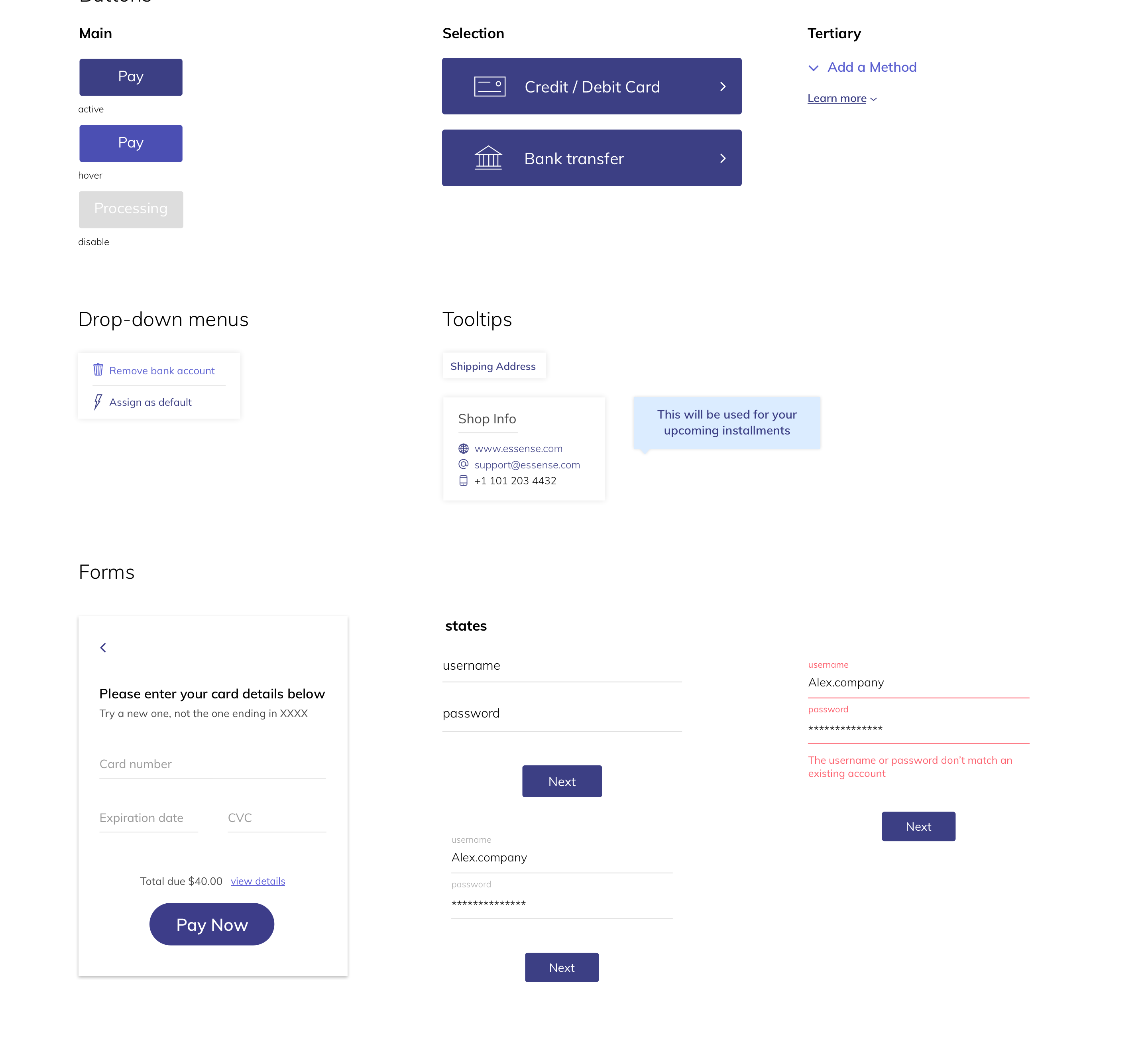
Language & styleguide
![]()
![]()
![]()
![]()
![]()