Bizzabo Networking Solution
Bizzabo is an all-in-one event-planning solution designed to help organizers create business events of all types, including in-person, virtual, and hybrid events.
The Event Experience OS is an open platform that allows event experience leaders to manage events, engage audiences, activate communities, and deliver powerful business outcomes. The new platform is aimed at restoring aspects of human interaction and networking lost in the translation to the virtual world after Covid19.
My role: Lead designer of the Networking solution

Product objective
Enable event attendees to achieve their personal and professional networking goals by facilitating meaningful communication and connections at every event. Support them in managing and deepening these relationships before, during, and after the event.
The Challenges
Attendees in virtual meetings faced both practical and emotional challenges, including managing packed schedules, time zone conflicts, and balancing personal availability. Many were hesitant to connect, while organizers struggled with low engagement. Virtual fatigue added another barrier, further complicating the networking experience.
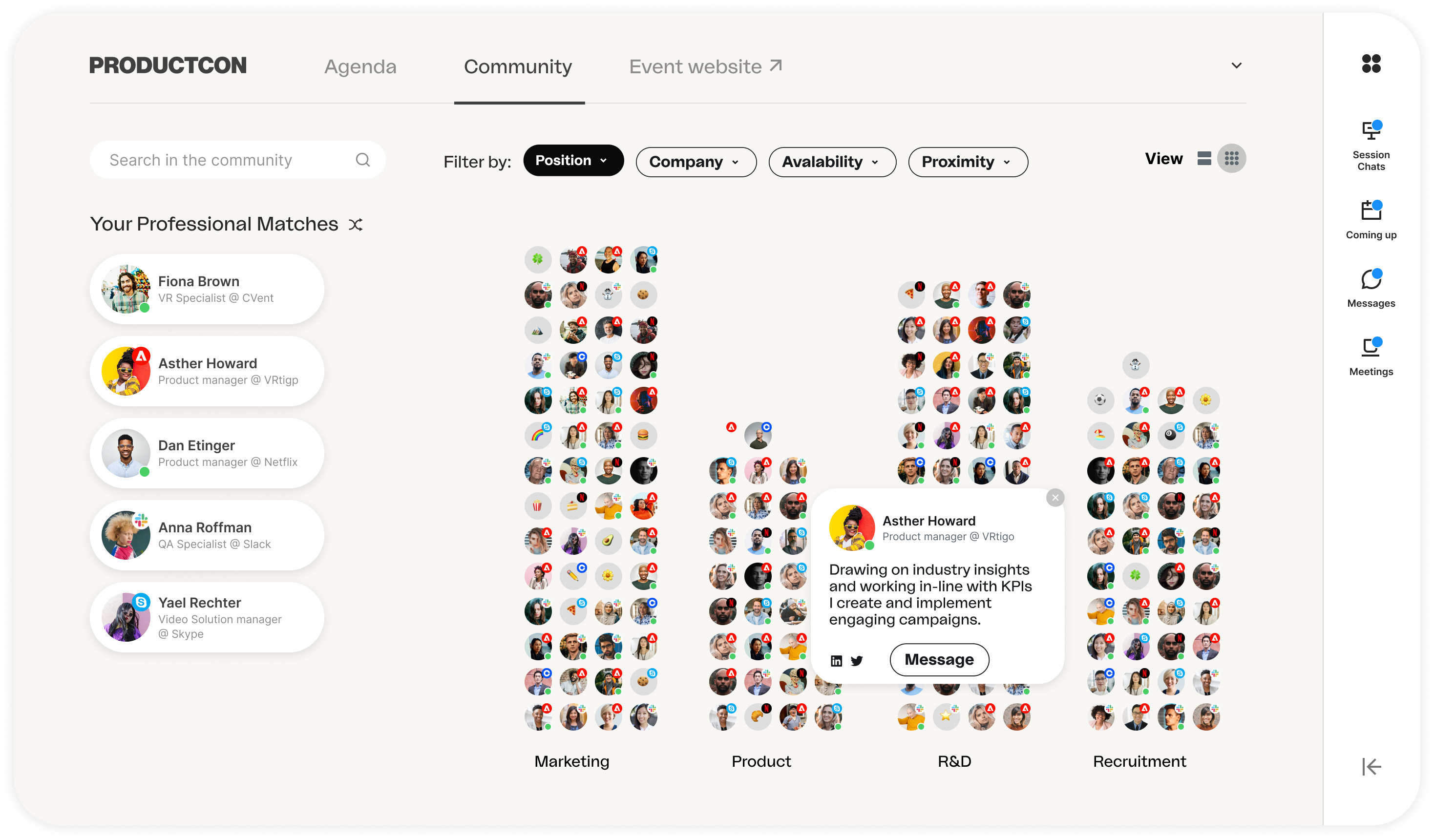
Virtual Communities: Attendees explore and connect with others who share similar interests,
professions, or locations, fostering targeted networking and meaningful relationships.
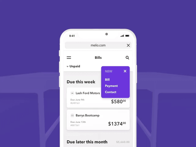
Networking solution
The scheduling tool supports virtual, hybrid, and in-person meetings, streamlining the process to address challenges like complex agendas, time zones, and varying availability. To overcome motivation gaps between organizers and attendees, I designed a user journey that guides attendees through an easy exploration of their networking goals and interests, encouraging them to connect confidently.
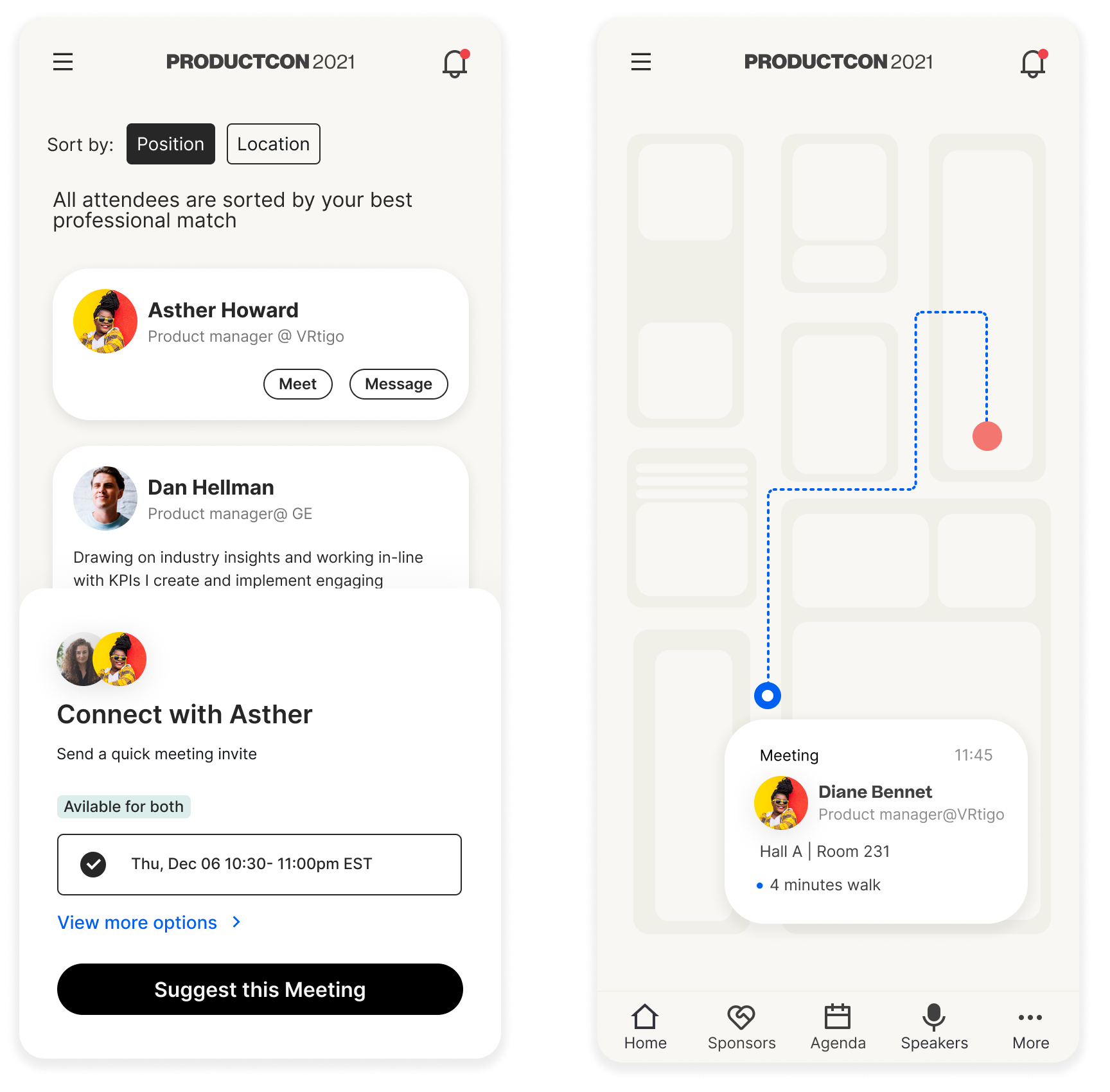 Scheduled Meetings: Attendees set availability and use AI-driven tools to book seamless 1:1 meetings during the event.
Research and product vision
Password protected Click here
Product design for Melio Payments
Melio’s mission is to help small business manage their payouts by providing a smart B2B payment solution tailor-made for their needs. As the Lead Product Designer for the company’s flagship product in its early market-fit stage, I had the opportunity to structure and design the initial user journey, including Onboarding and Progressive onboarding flows. I was also responsible for designing core features such as the Single payment and Batch payments flows.
My role: Lead product designer, Core product
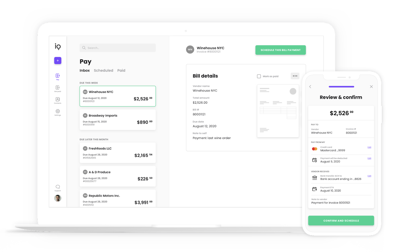
Melio's digital accounts payable and receivable dashboard provides a single, integrated tool that allows small businesses to transfer and receive payments quickly and easily, giving oversight and control over cash flow, eliminating late payment costs, and saving time.
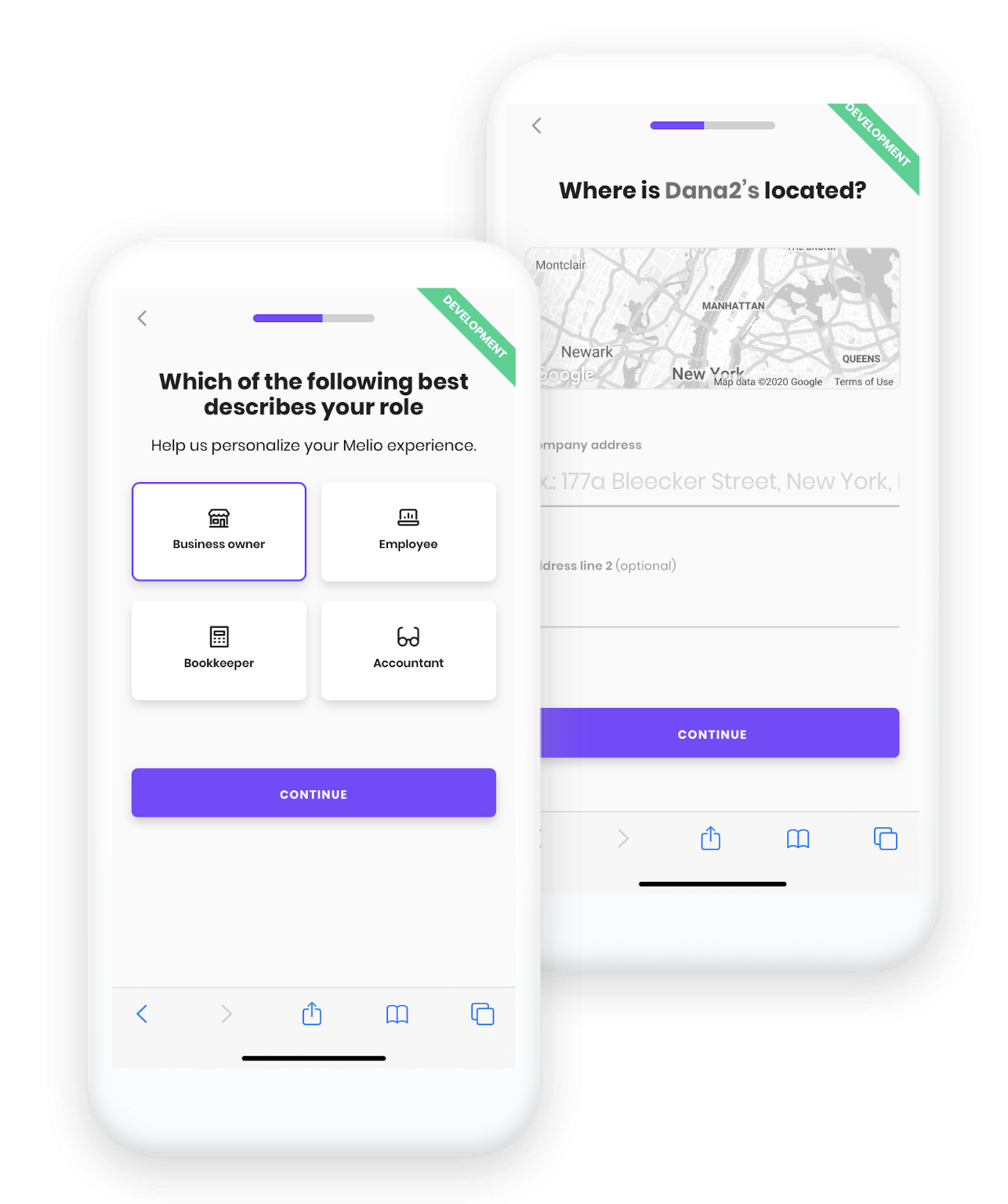
Onboarding flow
Upload & convert invoice ( IDP + OC R)
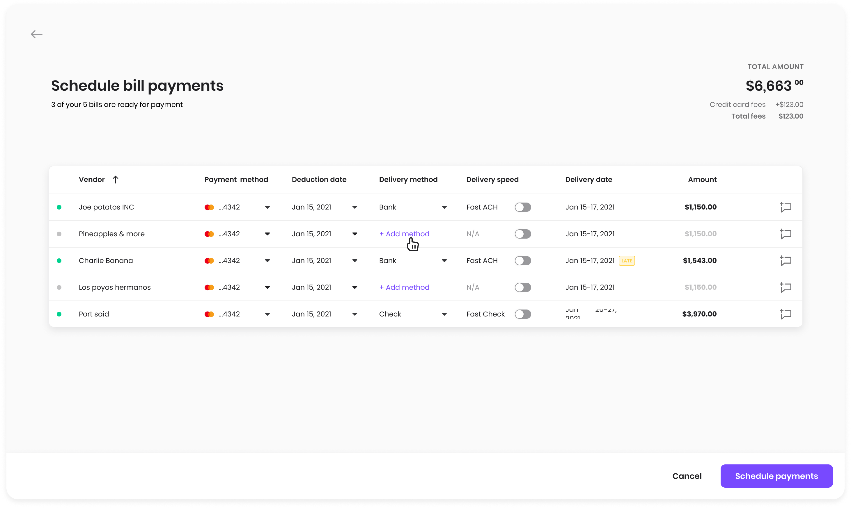
Batch payments flow
Case studies: 01 :Onboarding flow 02: Batch payments,
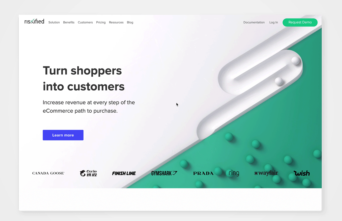
Riskified website 2019 view site
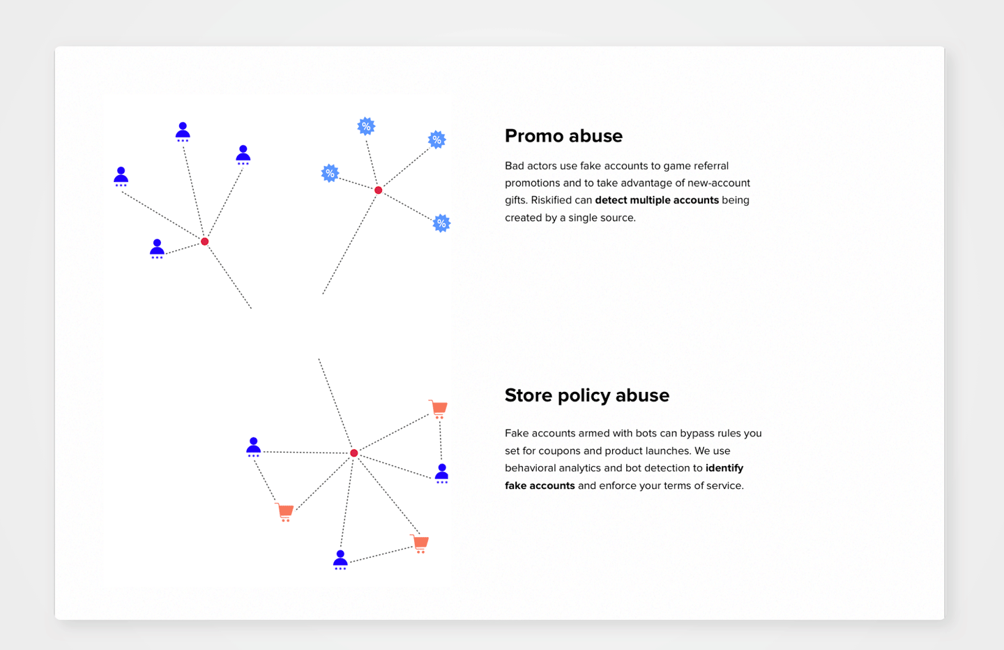
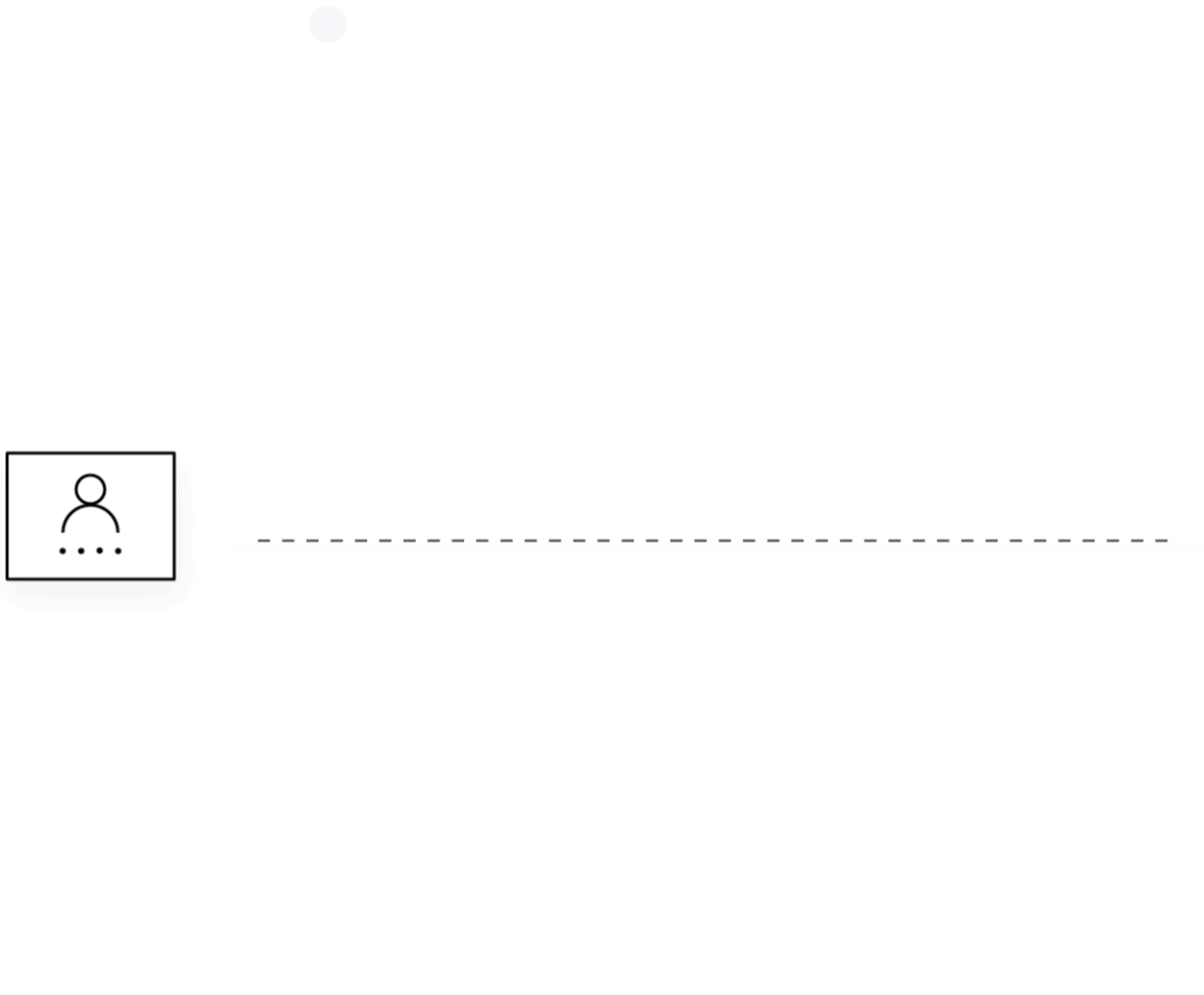
Visual concept & data visualization for Riskified’s new website. The design challenge was to exaplin multiple complex processes with a few easy to understand visuals using a consistent and minimalistic visual language. Created in coloboration with Riskified’s design team.
Riskified is a B2B fraud-solution company in the eCommerce field. Riskified uses behavioral analysis, elastic linking, proxy detection and machine learning to detect and prevent fraud.
Solution-overview page
Data visualization design & animations
![]()
![]()
![]()
![]()
![]()
![]()
![]()
![]()


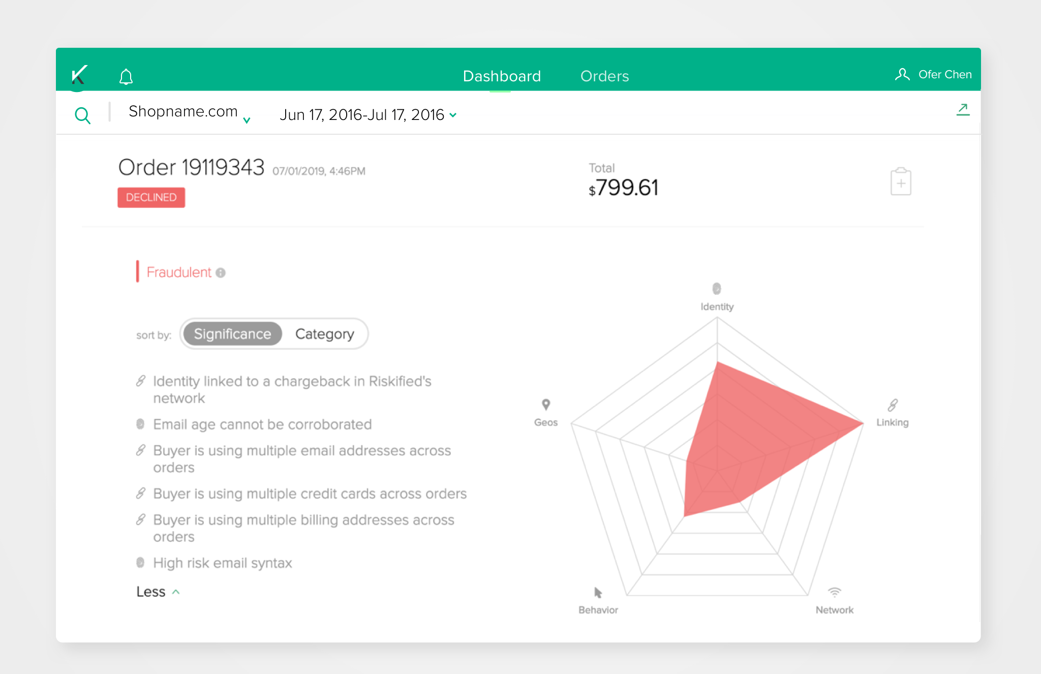
Riskified web app
Riskified’s customers and app users are e-commerce merchants. The app provides them full transparency on Riskified’s decisions over their orders as well as supplementary data on segments of interest.
There are two types of end-users:
1. Administrators
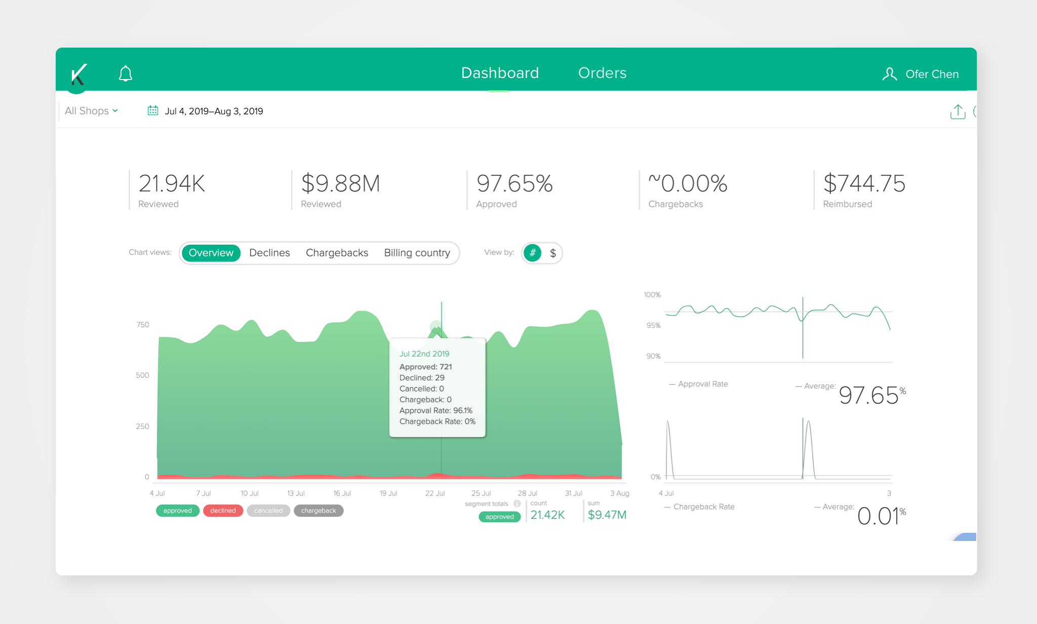
They want to get a general overview on the orders transferred to Riskified, approval rates and decline reasons for each order.
These users mostly use the dashboard view.
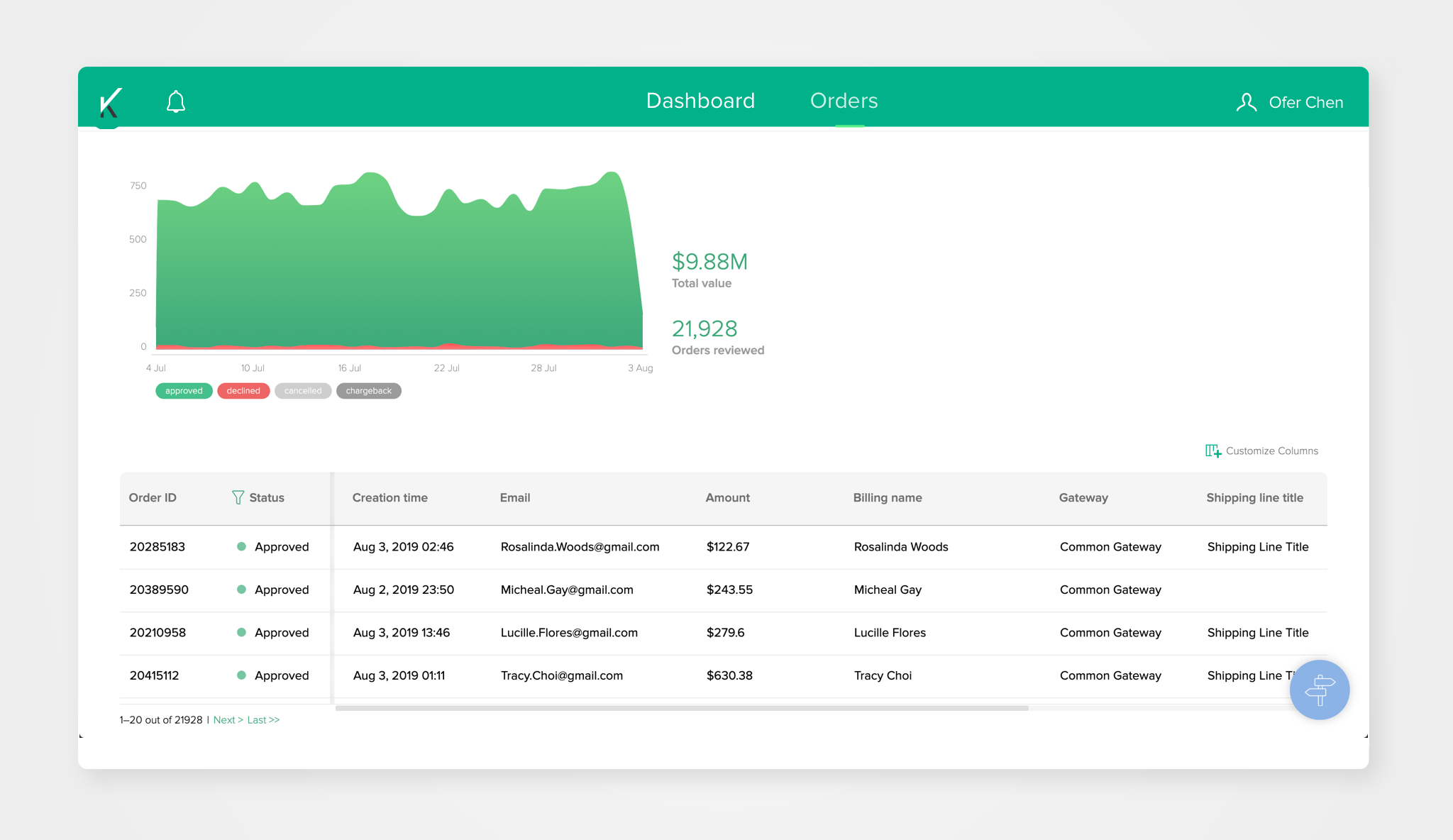
2. Customer support
They are in contact with the merchant’s customers and their job is to perform actions related to specific orders such as submitting chargebacks, filing disputes over Riskified’s decisons and so on. These users are more exposed to the “Orders” tab which allows access to a specific order’s view and actions related to it.
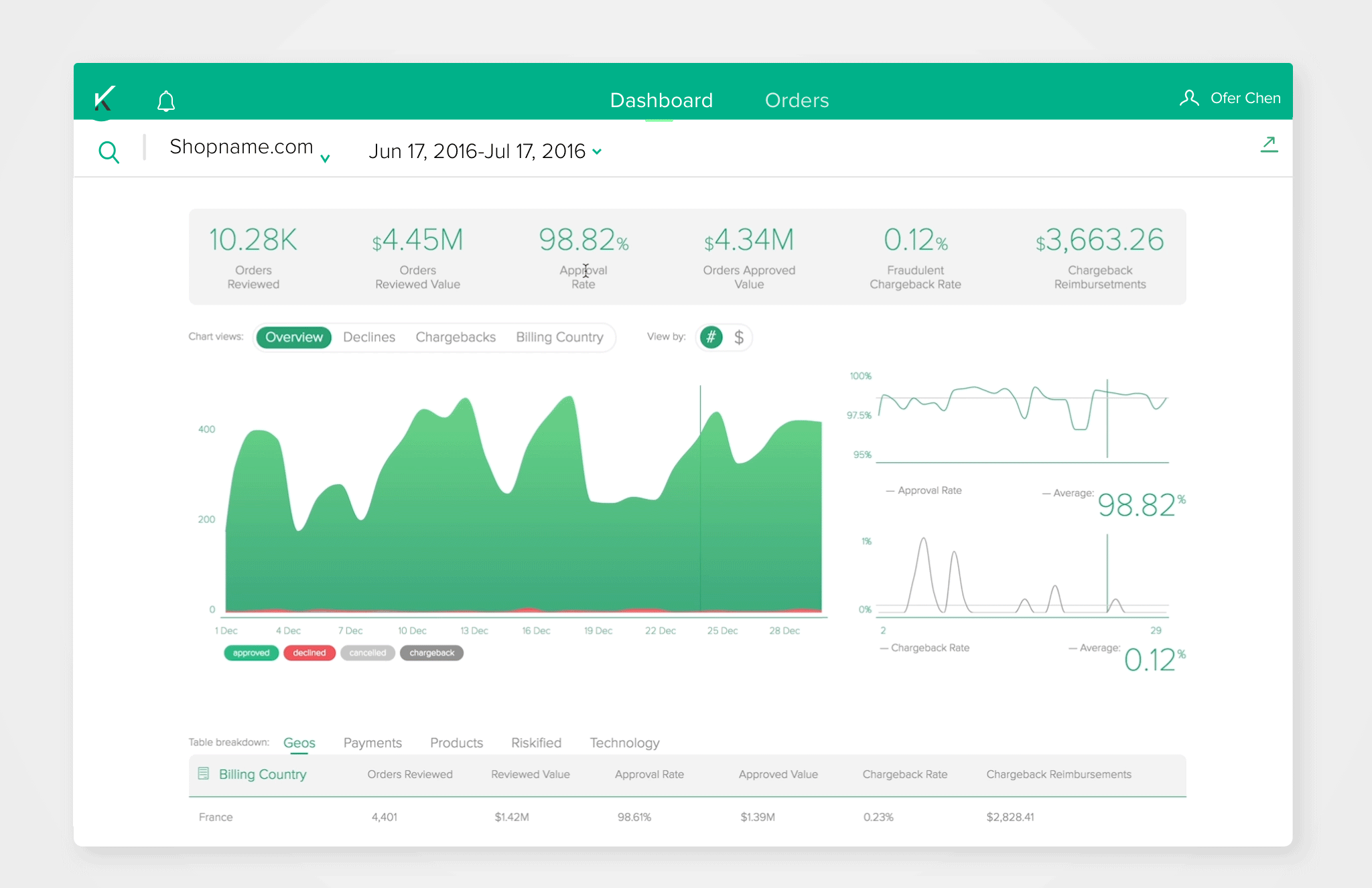
1/ Dashboard tab
2/ Orders tab
3/ Declined-order view
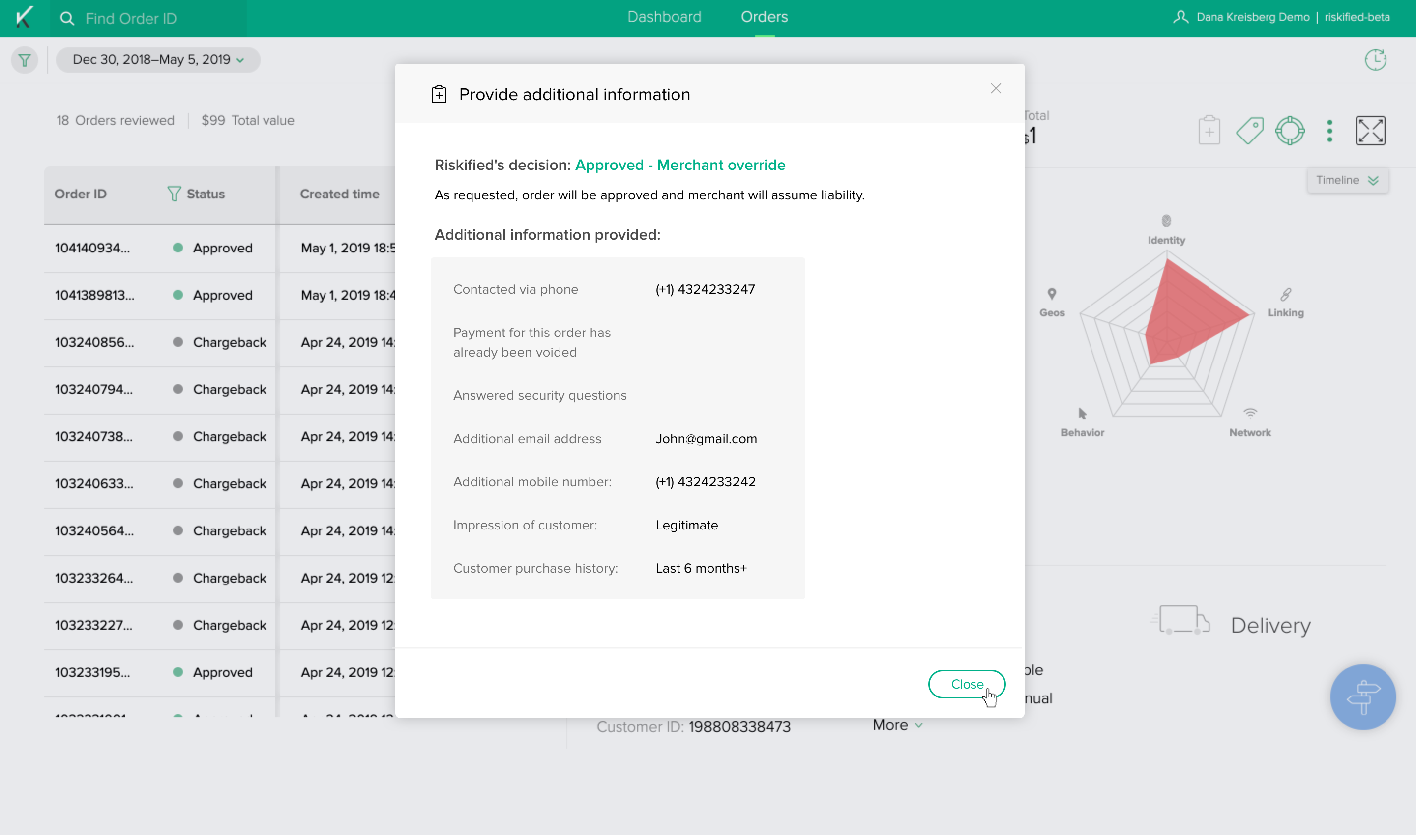
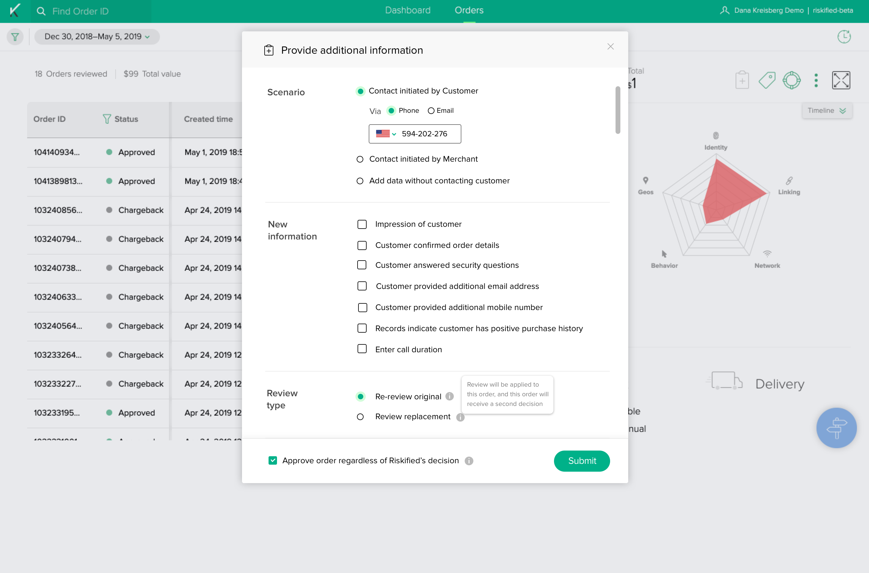
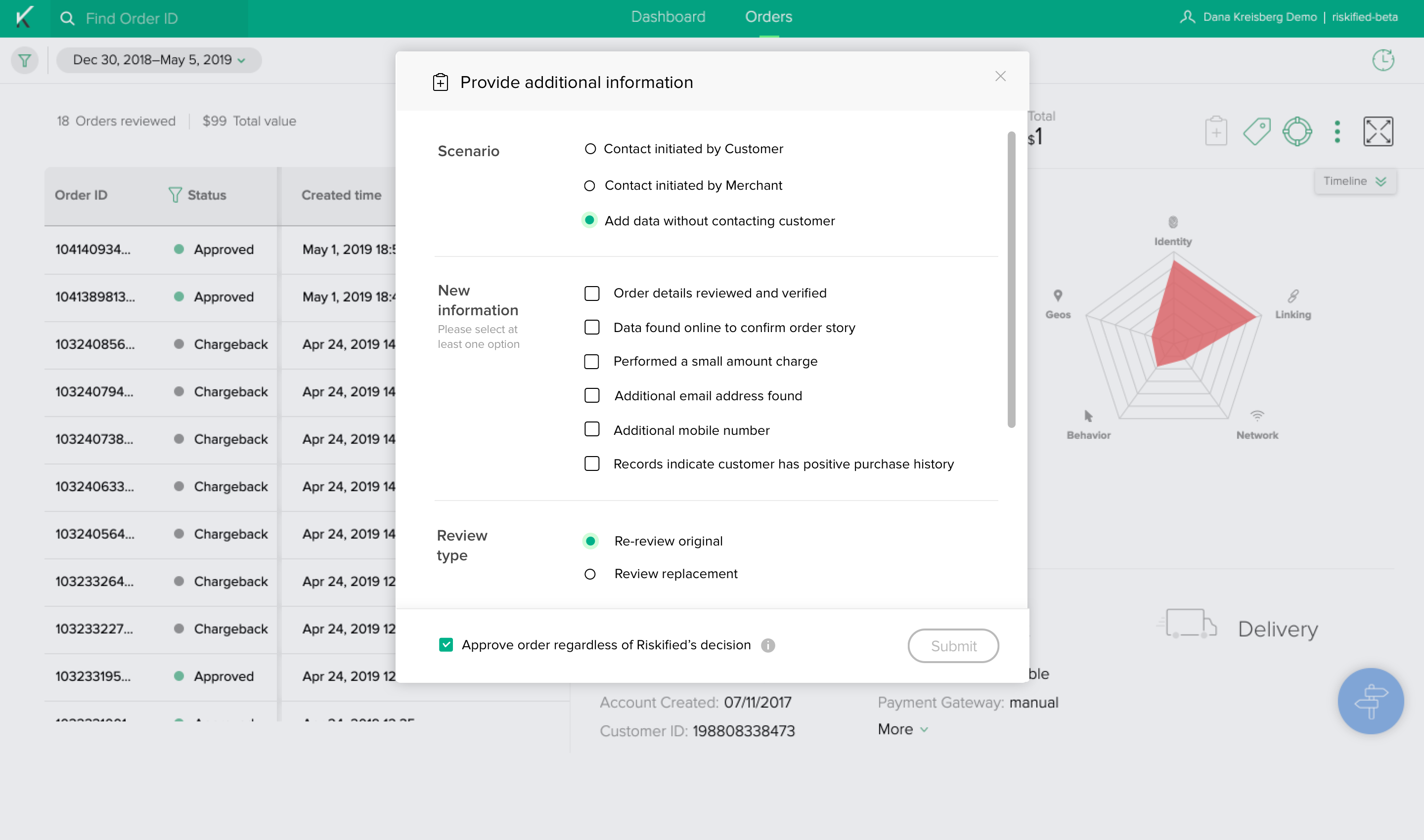
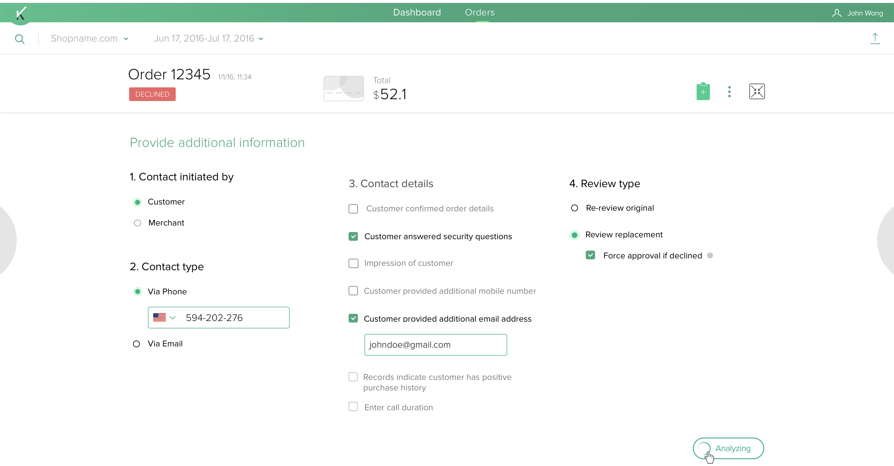
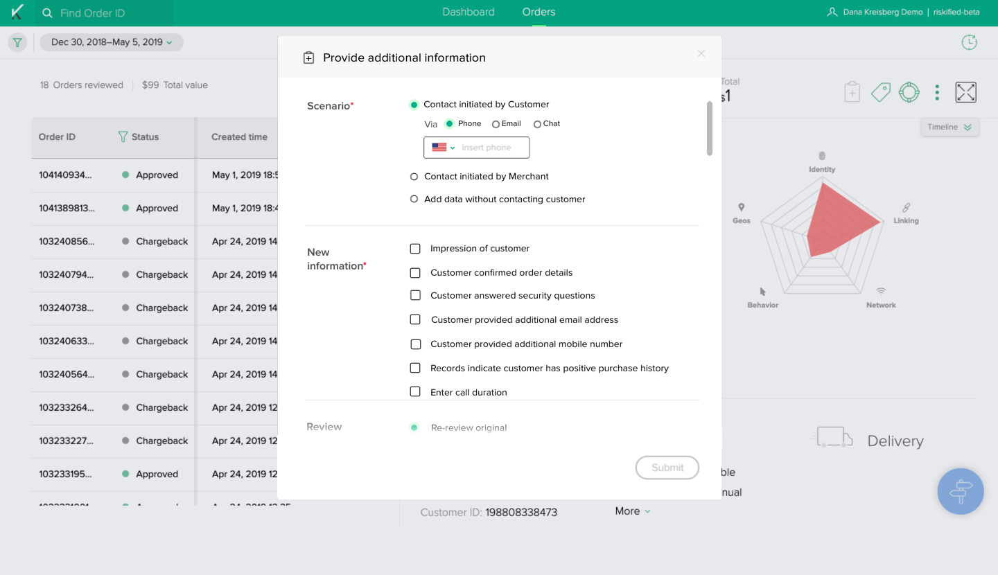
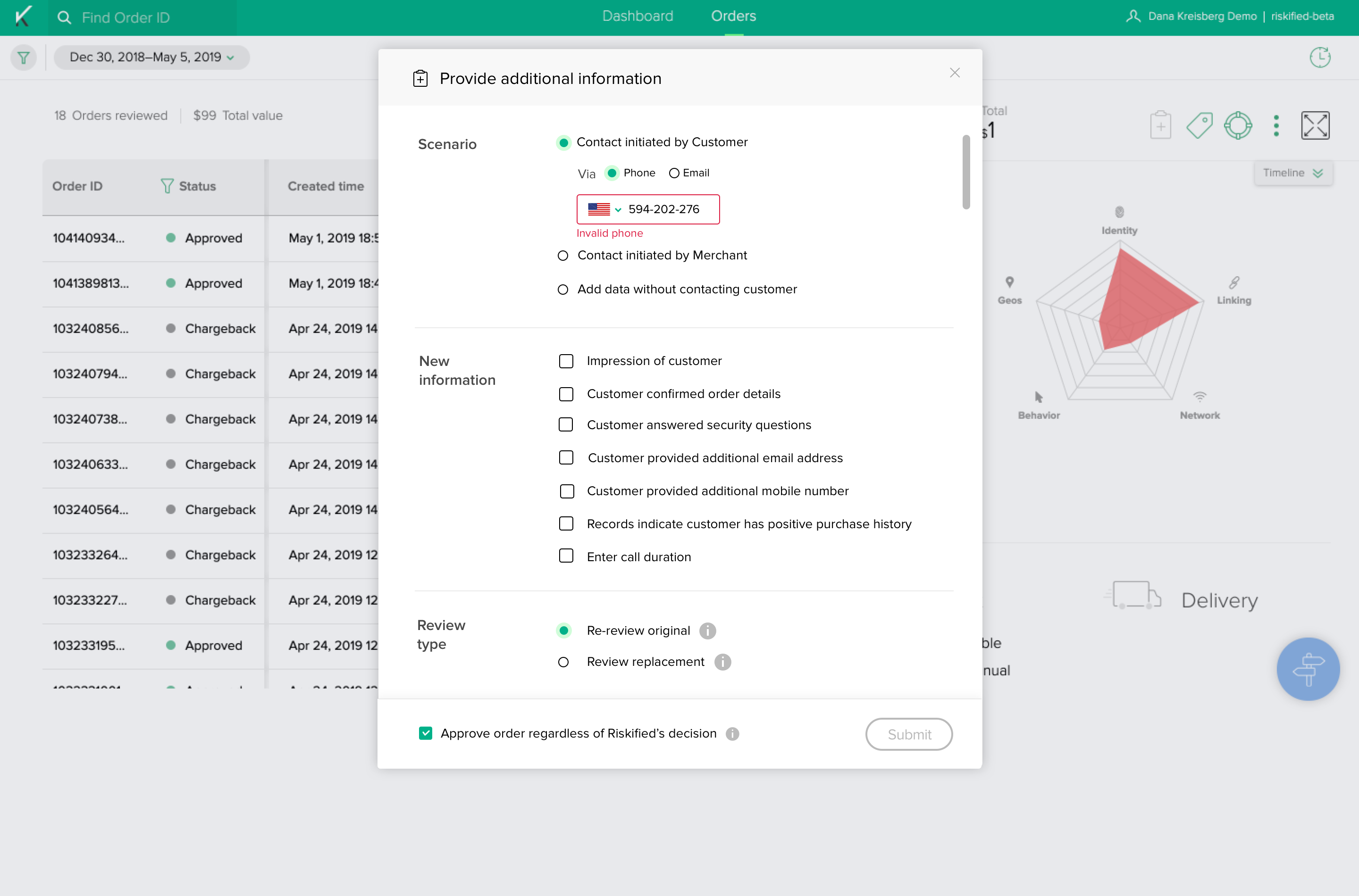
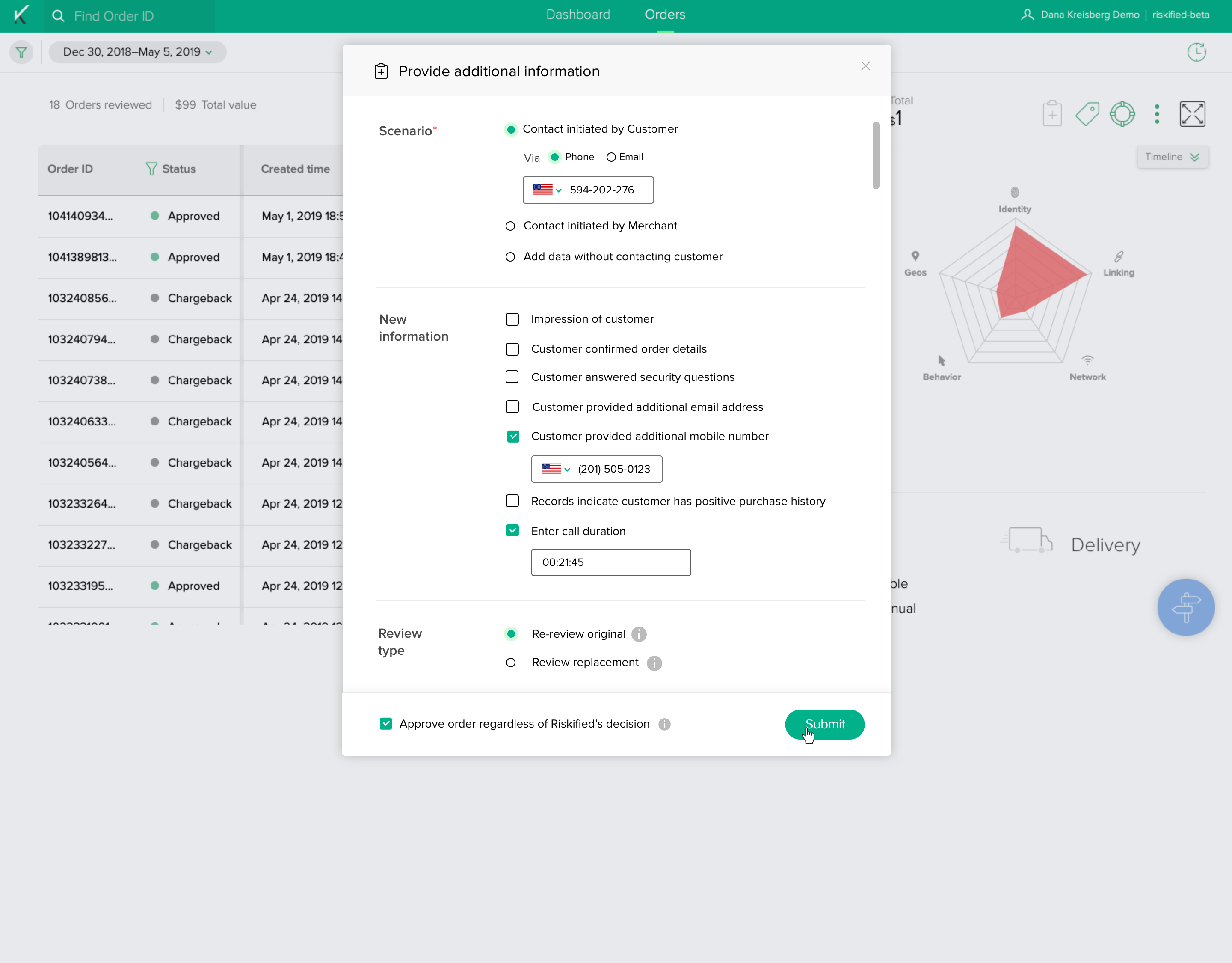
Case study: Post decline flow re-design
Background:
Riskified protects e-commerce merchants against fraud by approving safe orders and declining fraudulent and risky orders. Merchants can view these actions with Riskified’s web app. “Post decline flow” is an in-app action that allows merchants to file a request for reexamination of a declined order if the merchant believes it to be non-fraudulent.
There were some factors that made us to re-think current flow design and optimise it:
- New functional requirement - for each merchant:
such as “No contact” scenario, and an “Override decision” flag - Custom configuration for each merchant:
not all users have access to the same flow or have the
same mandatory sections as others. The flow needs to be customised in an easier way. - Current UX/UI is not appropriate- Horizontal form is not intuitive and requires high maintenance and optimisation for each user.
- What are the users’ pain points?
- Frequently
used actions are complicated to perform
- Want
more self-service solutions instead of contacting support
- Call center agent - After / during the communication with the customer, agent goes to the webapp,
searches for the order and opens the acti
- 2. Fraud agent - Manual review queue
Reviews order
Finds new information Opens the PDF action
- Per each functionality/task performed in UI:
- Frequency of each feature in the flow - Daily
- Cost of mistakes - Contact information and decline override are critical
- Relative Importance and Hierarchy - This is the most “important” action in the webapp
- Reduce number of tickets to support
- Ability to deprecate the old feature
- Ability to customize the form
- Increase usage
- I redesigned the action to be a sectioned vertical flow, that is easy to be customized per user.
- The from is fixed-sized, with a sticky footer.
- I exported the “Override decision” checkbox to be positioned on the footer so in will be constantly revealed. That in porpuse to avoid misunderstandings in cases in which merchant have a default choice active (on/off), and only two mandatory inline sections. (In othe words: So they won’t click the “Sumbit” btn before the went threw all the information provided.)
Old design
![]()
New design
![]()
![]()
![]()
![]()
![]()
![]()
New design

: :